
A sliver of Motion: Animation Tests
- Terry Marks

- Jul 25, 2022
- 3 min read
This section looks at several animation tests, discussing their viability, the issues that arose as I worked on them and the possible uses for these animations. The combined comic-animation style may be something I come back to in future and these tests are likely to prove invaluable at that point.
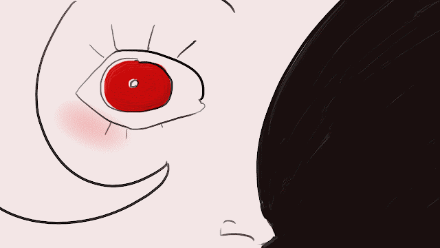
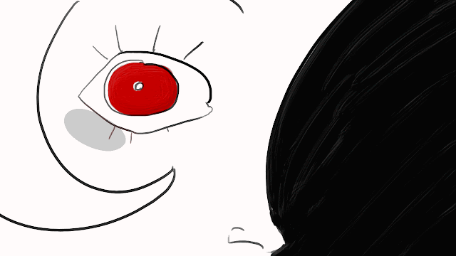
The above two images show what diparity can occur when exporting from TV Paint. While the left example is closer to the original frames, the right example has been compressed somewhat for a smaller file size that will play properly on my non-industry standard laptop; the difference is mostly apparent on the blush. In order to ensure accessibility it was proven to be optimal to work mostly with flat colours in the animations so as to minimise the difference that results from exporting. This led to the limitations on colour and shading that have characterised the comic and have stuck with this piece, despite the move away from animation. This was also an experiment to discover the limitations of TV Paint and how layers might work. In these images the eye is the only animated element on an animation layer. The rest is a static image layer set to "hold". This results in a creepy disjointed effect similar to some cuts in The Tell-Tale Heart (1953), and really helps to encapsulate that uncanny experience. This could be a useful aspect in a blended medium, offering the reader a different form of jumpscare when they notice that their static comic is moving. This may have been more visually interesting if I had added a boiling effect to the background by going over it a few times and setting it to loop. The worry with that however is that it may draw the viewer's eye away from where I want them to be looking, an important part of controlling the narrative.

This is another animation test inspired by Tell-tale Heart and it explores insect movement in a very stylised fashion. Jittery, disjointed, and too fast to follow with the human eye, an insect flapping its wings slowly usually indicates something being wrong. An insect in flight has a very different quality and movement to bird flight, which I previously explored in an older animation project. While birds spend most of their time in the air gliding and only flap their wings occasionally; insect wings are constantly in motion. Comparing the two this animation interest. While they essentially go about similar adaptations from a biological perspective, the visual/animated lens restricts the ability to showcase the differences.
Had I decided to make use of this animation I would have added more detail, perhaps an excessive amount when the moth hit the camera. Once in position I would have held on to that for an uncomfortable amount of time before cutting away. This would have served as a fantastic jump scare in the animation. Both of the above shots were versatile enough that I contemplated using them in the comic to add something a little more interesting, however the modifications required proved too time consuming for my limited schedule.

This final animation served as a rough exploration of the mirror scene from the comic. Here Hilda has almost totally lost her grip on reality and the transition to moths was a very interesting form of scene cut. The level of detail required to get it as I wished however, while a possibility in the future, was beyond my equipment and timescales.


Comments